A Dive into the (O)CM Box Interface and User Experience
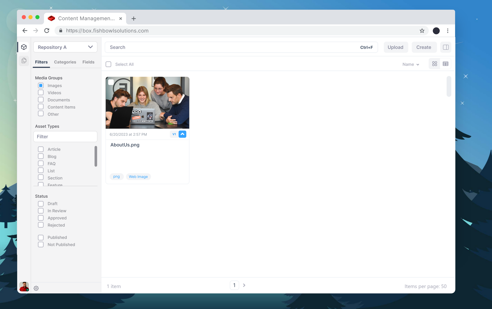
Over the last couple of days I've been giving you a glimpse of the new CM Box interface and highlighting it's core features.. It's still early days and I'm expecting there to be a lot of changes over the next six months but I thought it would be great to discuss and show you where we are with the user experience and overall functionality of the interface.
Similarities with OCM User Experience
One of the key things you will notice about the CM Box User Experience is it's similarities with OCM - we have done this because we feel that the OCM experience has been well thought out and closely following this UX provides an easy onboard experience for existing customers leaving OCM - where no additional training is required.
There are some changes however as the team at Fishbowl Solutions have worked daily with OCM for the last 7 years; thought that has gone into how can we further improve on the experience as a user and strengthen the overall platform experience whilst keeping a consistent familiar interface that existing Oracle Content Management Users know today.
Themes
Don't worry - I know a lot of users don't like dark mode and all the screenshots I've shown and snuck to date into my posts are of the dark mode interface - but we do have two themes user can toggle between - yes; light mode does exist and yes this is controlled by the user from their profile page.
Responsive
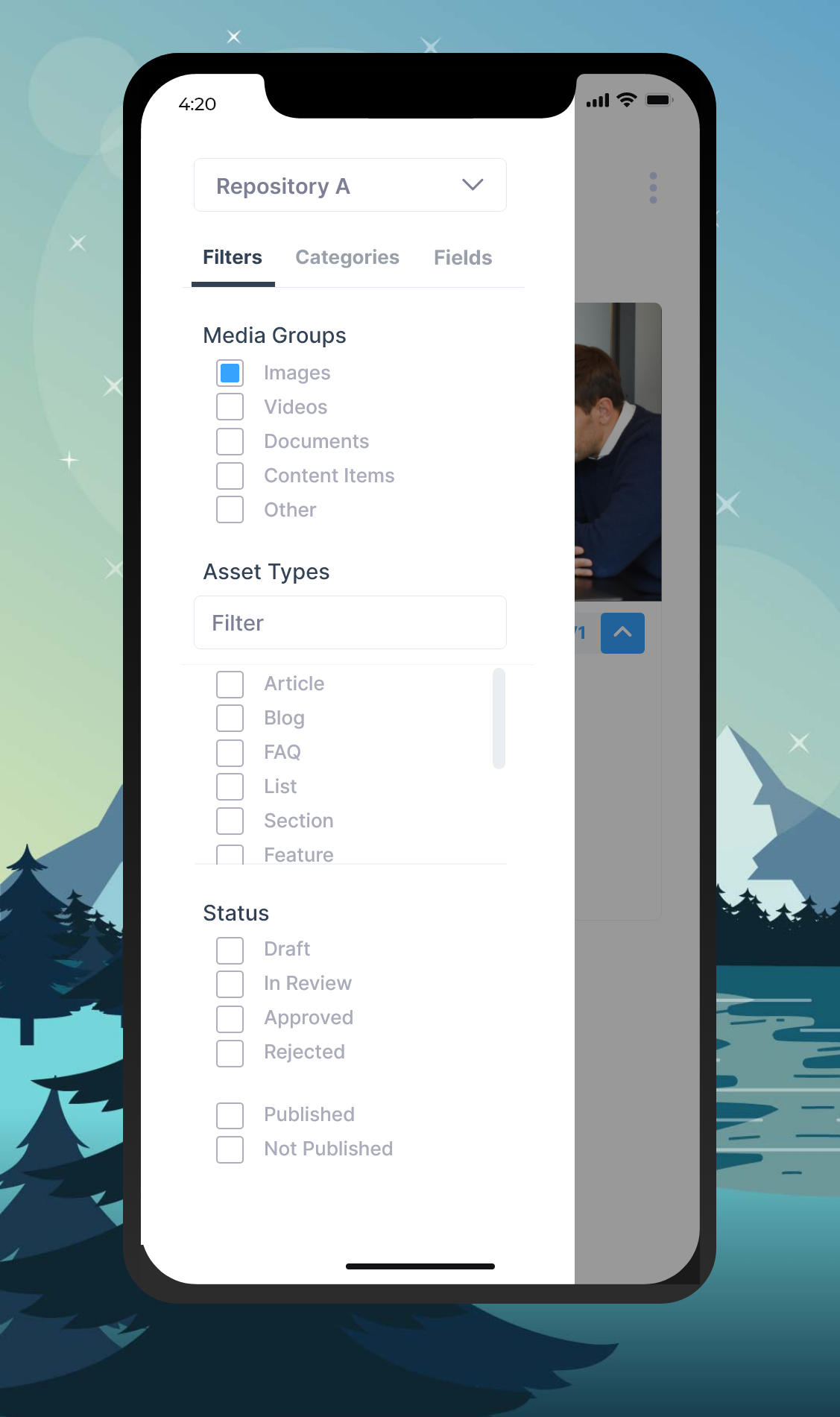
Where would we be without responsive design; yes the app has been designed as a responsive Progressive Web App and we will be exposing it in the future as a TWA (Google Trusted Web Activity) that is downloadable from the google play store.
Multilingual (RTL)
We are actively working on this and hoping it will be part of our next release supporting the same language base as the existing OCM Platform with Right to Left support.
Embeddable UI
Yes; this is also planned you'll be able to drop in and customise the interface in the same way as OCM as an iframe and configurable object. There have been some thoughts and discussions for enabling the whole interface to be skinnable however this option it is not planned on the roadmap as of yet.
What's really changed?

One of the key changes is that we have removed the header bar giving you more space to access and search for assets.
The side bar that contains a drop down list of togglable panels ie taxonomies, properties etc has now changed to an icon set reducing clicks - we have also forced open the side panel showing key relevant information.
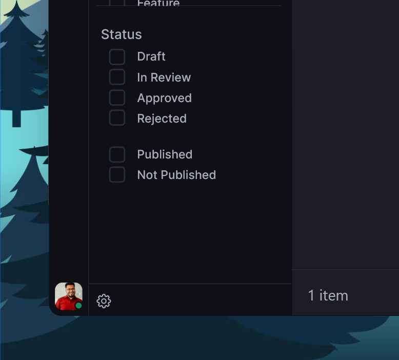
Your user profile has now moved from the top right to the bottom left of the screen.
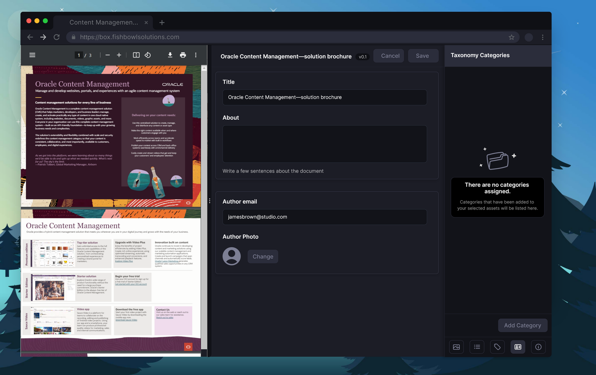
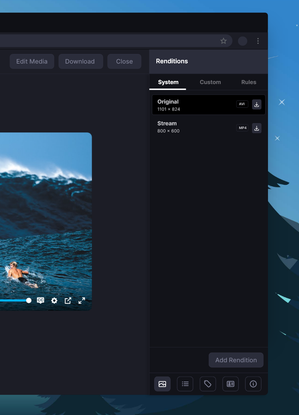
We have changed how you can edit Image and video assets as well as the renditions display as CM Box supports conversions of documents to PDFs - this means when editing a document you can see side by side your PDF preview and update it's meta data information.
As we are still early into this you will notice that some actions like publish at a future date, or move an asset from one repository to another has not as of yet made it into the release.
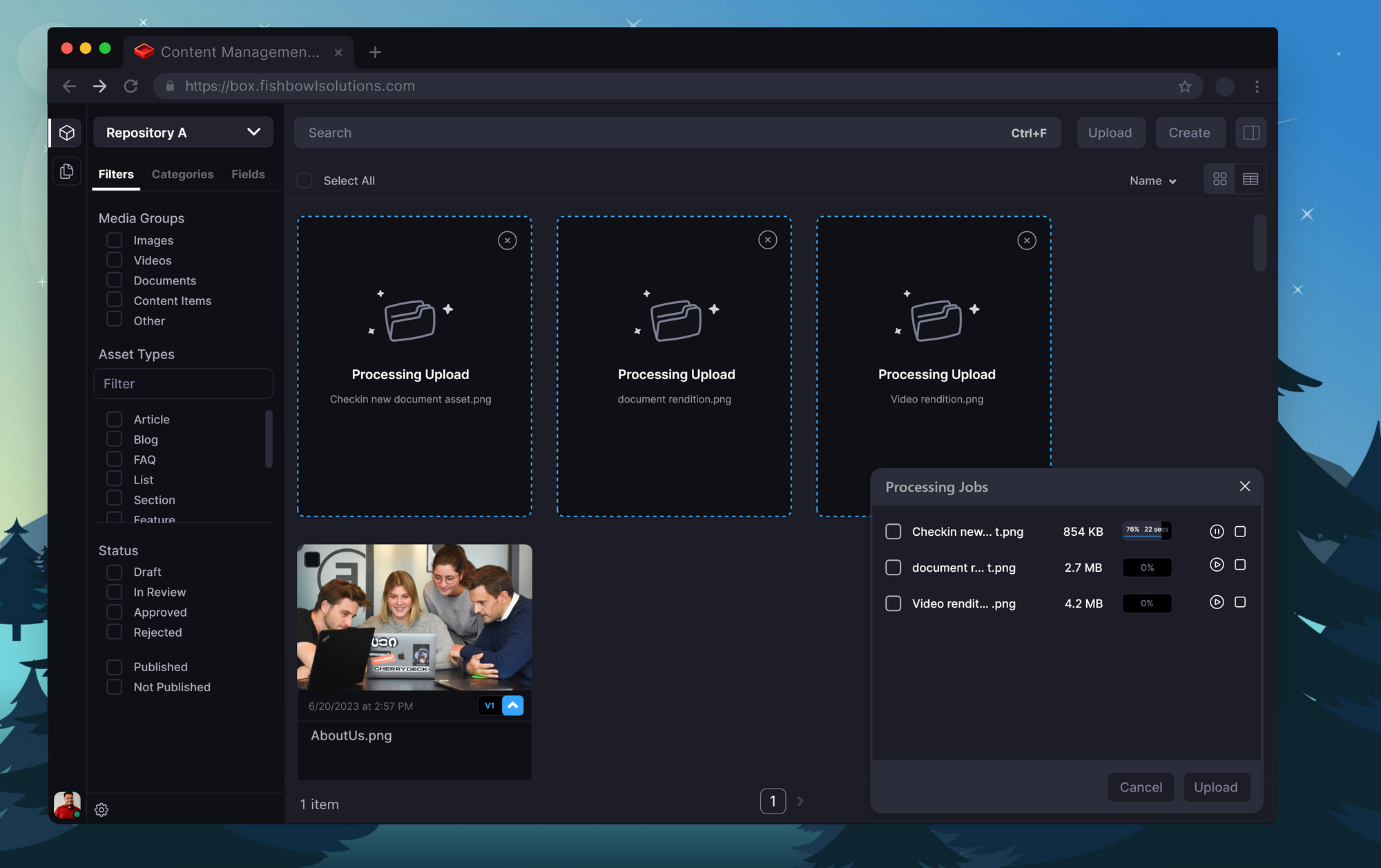
Quick Drag & Drop Upload has also changed and is displayed as an integrated model overlay instead of a full drawer panel.
What about Desktop App?
The app is a PWA so you can install it from your browser - but we will be working on a desktop app exposing WebDav interface to allow you to access the repository from your desktop file explorer with added support for Adobe Creative suite - but this most likely will come second half of next year.
Essentially an enhanced version of the OCM Desktop tool:
There is still more to come - so keep an eye out on this blog for more updates on the CM Box Roadmap and Demos.