Oracle Content Management Secret New Release..

You may have noticed a couple weeks ago; the Oracle Team snuck in an update with no official announcement or documentation..
What is this update?
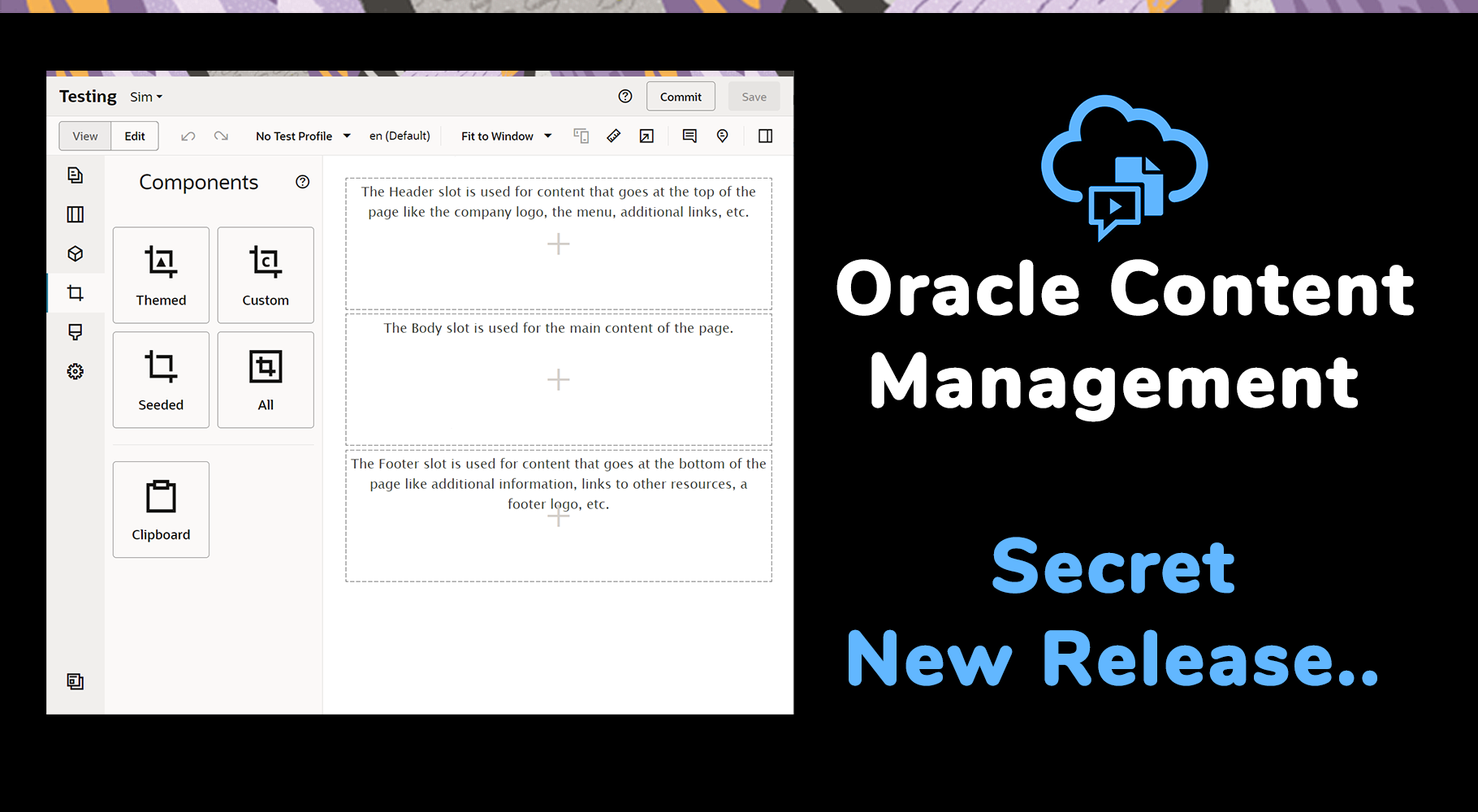
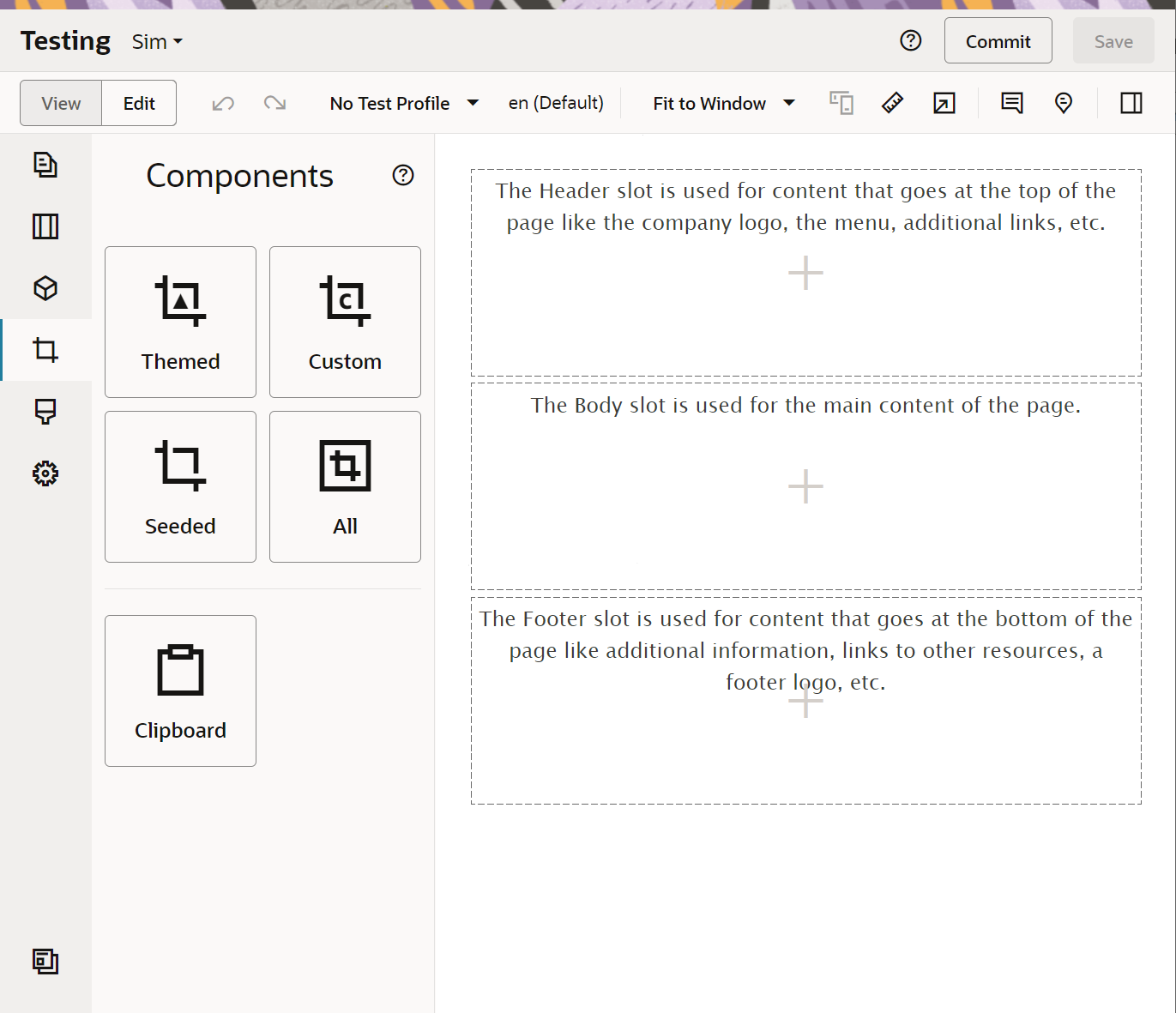
The updated Redwood Theme branded OCM Sites Editor Interface!

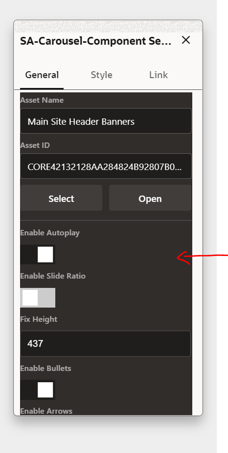
But unfortunately with this update a few things have become messy - that is if you have built and deployed previous components - you'll notice that the dark mode areas have now been replaced and with this any custom settings panel just looks ugly with the clean Redwood theme.

So lets take a deeper look at the updates and how we can quickly fix our custom components to blend in with the new Redwood Theme update within the OCM Sites Editor...
3 Steps
Step 1
Open up appInfo.json from your custom component and add "settingsStyle":"light", to your settings data like this -

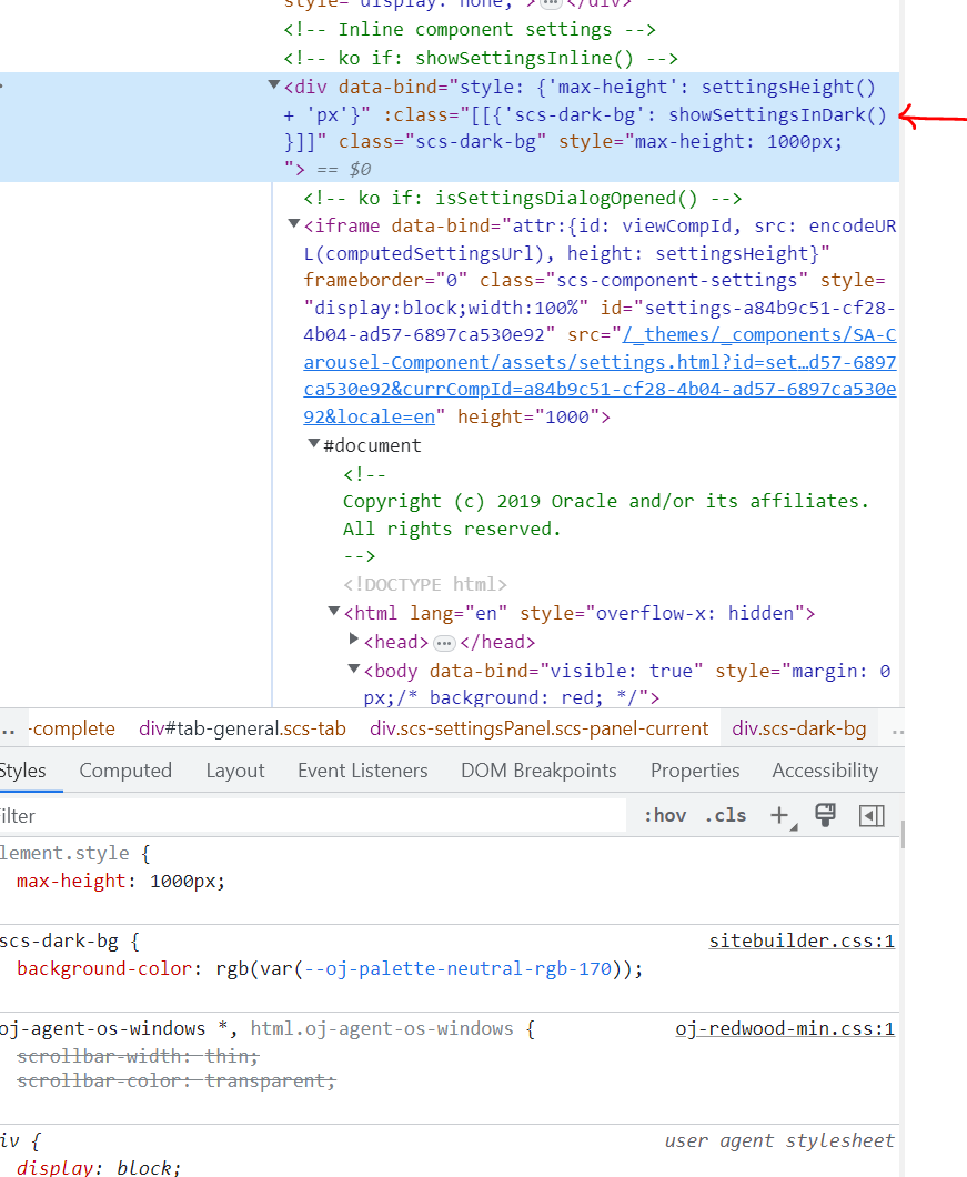
This updates the background wrapper style of the settings iframe and replaces the dark with light background - here is a quick screen grab of the generated code - the red arrow indicates the setting iframe wrapper.

Step 2
Open up settings.html and replace "app-styles.css" with "redwood.css" like this:

Step 3
If you have any additional custom CSS that you supply with Settings.html you will need to manually update this to match the redwood light theme.
ie For me I had a custom tab bar to switch the settings display panel based on the editor experience and how they wanted to customise the component interface. You can see it here - https://bitmapbytes.com/improving-the-ocm-sites-editor-experience/
That's all you need to do....
Now you should have a clean redwood light UI Settings panel for your editors to interact with!