The Oracle Content Management Mobile App

It's been a couple years since I had a deep dive into the OCM Mobile App.
It's had a number of iterations and rebuilds and so I thought I would jump in and check out the features - to be honest when interacting with OCM I have always used my desktop.
The Oracle Web UI is also responsive and works on Mobile, Tablet but there has never been a real need for me to access it in an emergency from these devices.
Downloads
If you want to try out the apps here the quick links:

First Impressions
The Dashboard
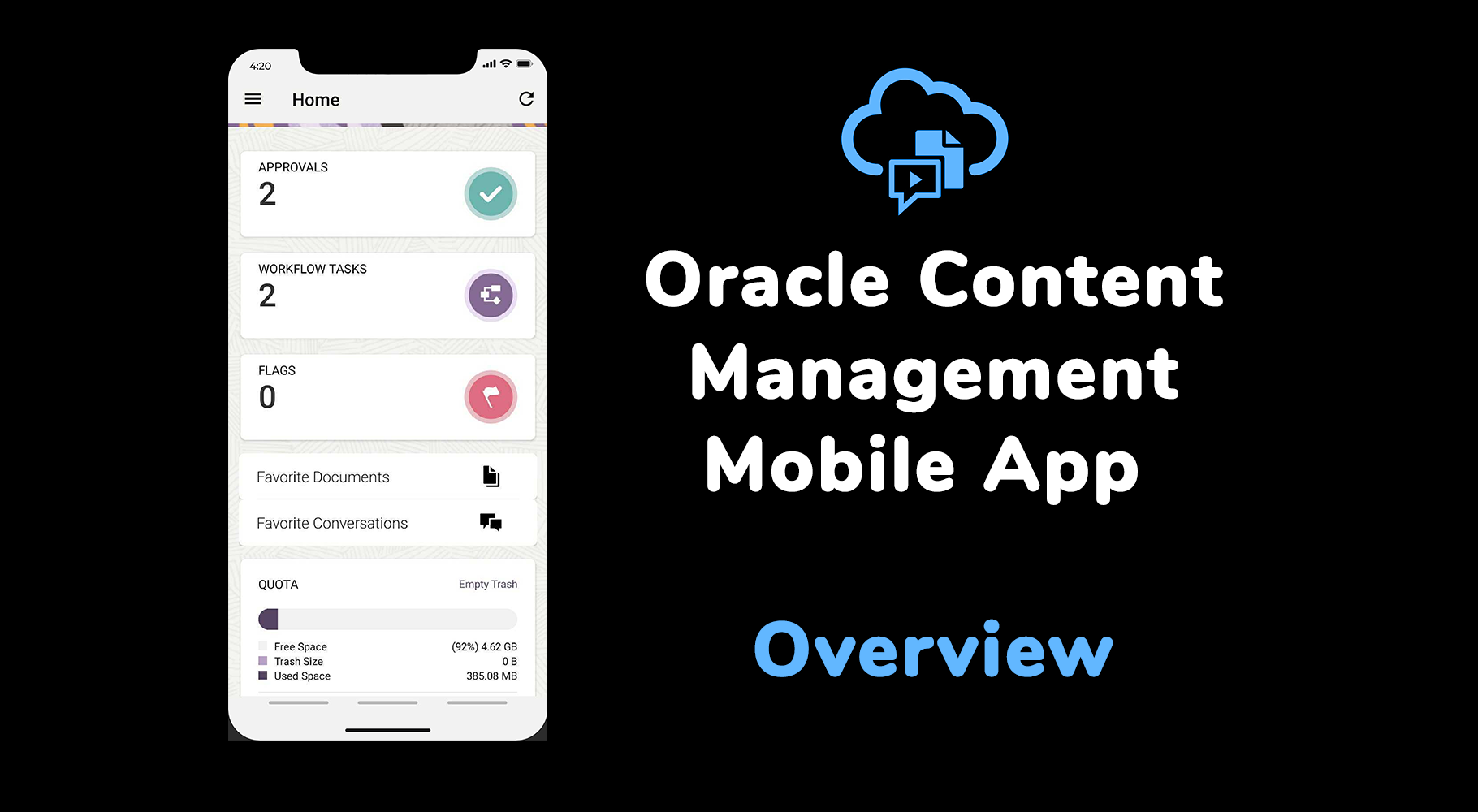
When I saw the new and improved dashboard on the mobile app the first thing I thought..
Why are these options not on the Web UI Home screen???

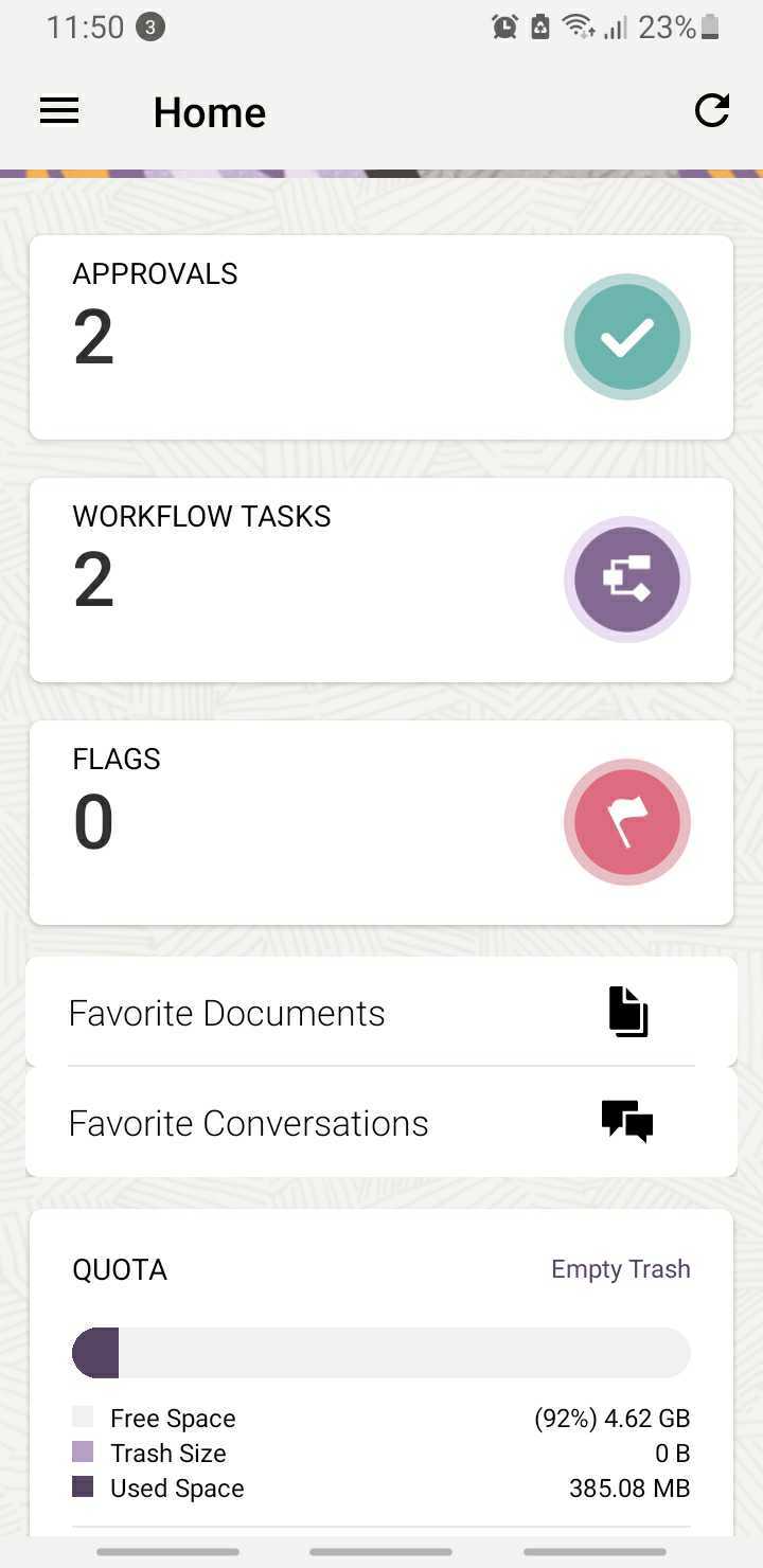
- It provides a clear view of the number of assets that need to be reviewed and approved via the integrated approval process and lets me quickly drill in and see the assets in reviewal across all repositories. Access the metadata and approve or reject the asset with a few taps... In comparison with Web UI I have to click around to get this info - there were assets sitting in review from other repositories that I had missed and were stuck in review state that I only caught due to the mobile app.
- If you have workflows setup and integrated with Oracle Integration Cloud you can also review and action the human tasks against the assets within a clean and quick UI - I thought this was useful - there are always going to be times where you need to be able to access and approve assets quickly and you are away from your desktop.
- Flags not a feature I use as it's tied closely with conversations - most of my chat is handled via Slack or teams these days.. but it could be useful if you use OCM Conversations and want to flag up messages to other people to take a look at and review content or chat streams.
- Finally Quick access to my Favourited Documents folders and Conversation with an overview on Quota of my Document Storage usage.
I did find a bug where the Trash Size shows as zero and I can't clean out the trash but I know I have some large files in hear that I need to clean out at some point.
Other Features
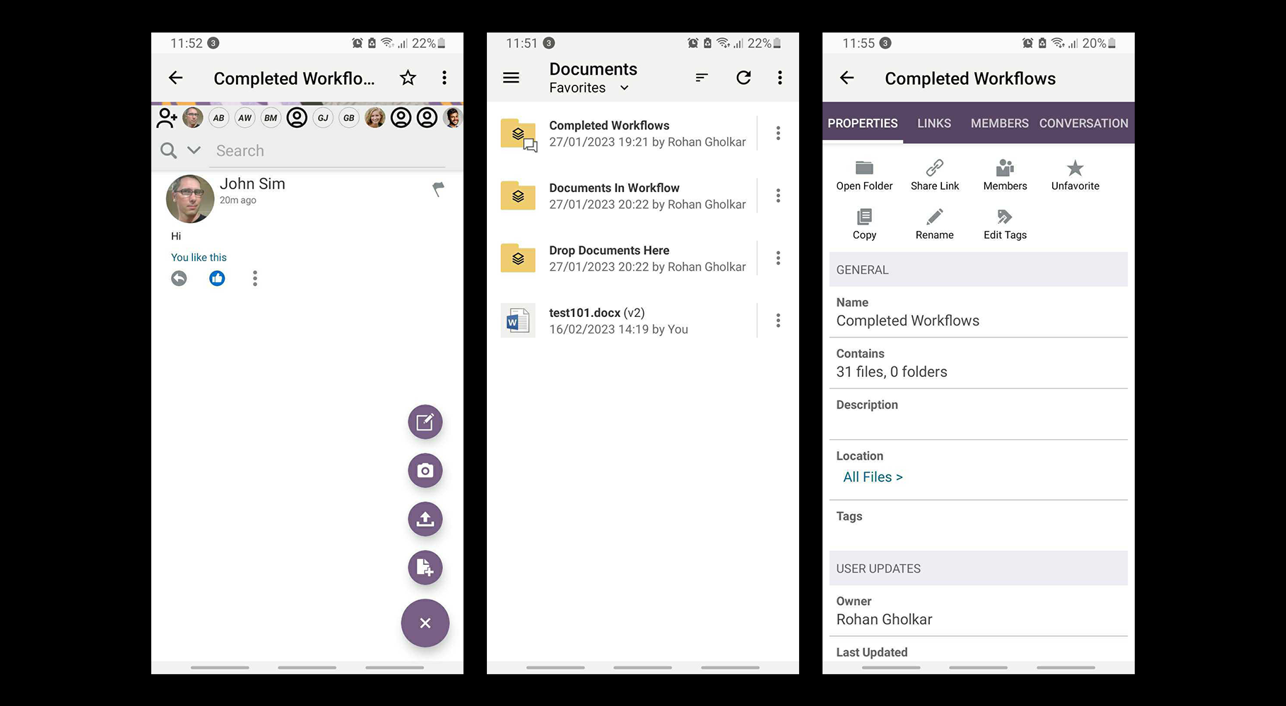
You also have access to Documents and Conversations and all associated actions that I could see that I could do with the Web UI; however.. with that said it felt strange not being able to access Assets within the mobile UI as it provides the ability to review and approve and access the assets in a workflow state but no ability to search update or interact and change or put the asset into a workflow state?

The performance and accessing documents felt quick and native and clean the only issue I ran into was that I was unable to use the share capabilities within the Android Mobile app - every time I tried it was as if no link wasn't being passed across.
Conclusion
If you just need quick access to Documents, and the ability to review and approve assets on the go - this is a great little app. However if you need more power and full suit of options for developers and access to assets - I'd stick with the responsive Web UI.